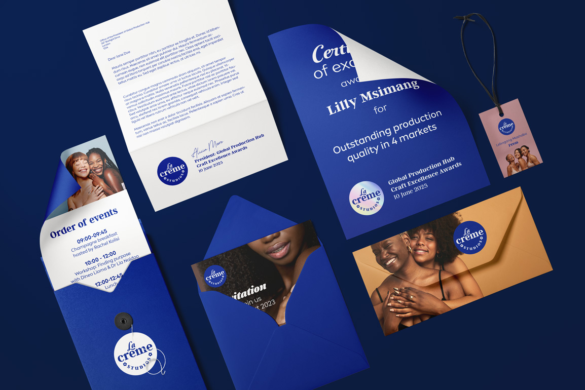
I designed 4 logos that took inspiration from the iconic blue NIVEA tin.
The chosen logo harkened back to the classic feel of the 1925 tin’s serif typeface, while also acknowledging 1959’s tin’s shift to include a beautiful script typeface. The leg of the L functions as the accent on the e of Créme, blending the 2 typefaces both stylistically and functionally.
Finally, as a nod to purpose (production) and towards the parent brand (Prodigious), the rounded star shape was incorporated as a finishing touch.


